



About Course
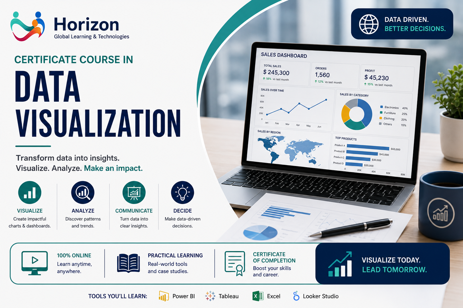
The Certificate Course in Data Visualization equips learners with the knowledge and practical skills to transform complex data into clear, interactive, and meaningful visual insights. Participants will learn how to design impactful dashboards, charts, reports, and data stories that support evidence-based decision-making across healthcare, public health, business, research, and development sectors.
Designed for data analysts, healthcare professionals, public health practitioners, researchers, programme managers, and business professionals, this course combines industry best practices with hands-on exercises using leading data visualization tools.
Course Content
Module 1: Introduction to Data Visualization
-
Fundamentals of Data Visualization
-
Principles of Visual Design
-
Data Storytelling
-
Best Practices

 admin
admin